It’s gone.
Just like that. The Fitbit app vanished with the launch of the Fitbit Air.
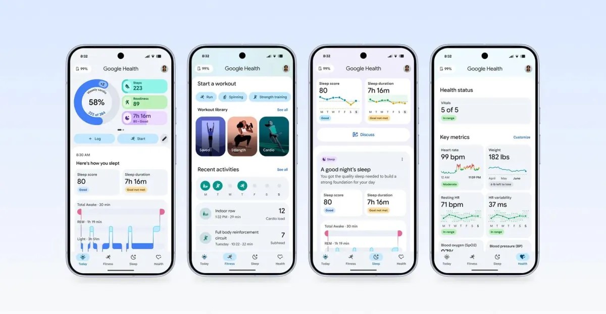
Google didn’t whisper about it. They announced it weeks ago, but now the hammer has fallen. Google Health is here, replacing the interface millions of us navigated without thinking for years. The response?
Frustration.
Confusion. A chorus of users begging for their old dashboard back.
A Screen Full of Noise
One Redditor summed up the immediate headache: I can’t even fill my home screen.
They’ve given you two large tiles. Just two. Then it’s just scrolling, endless scrolling, into void.
The landing page keeps a sliver of steps and basic stats up top. Noble gesture.
But the rest of the screen?
Reserved. For AI chatbots. For chatty notes. For updates I didn’t ask for.
My personal experience was sparse. The bot had nothing to say.
For Richard Lawler, our senior editor, it was different. It asked about his plans for the day.
He wasn’t ready for a morning debrief with an algorithm. Not really.
“I can’t even completely fill up my home screen.”
Some people actually like this. One user asked for a moderate circuit workout using office equipment, logged in with the bot, and felt great afterwards. Another called it a “helpful feature” for logging a missed sleep session.
So it’s not broken for everyone.
Just for the ones who wanted to see their data, not have a conversation.
The Interface Crisis
“This graphic UI looks like something an eight-year-old would make,” one user wrote.
Brutal. But accurate to how many felt.
Why scroll through paragraphs of AI slop just to find my activity history? I walked to the grocery store for fifteen minutes. I do not need a platitudinal eulogy for that walk.
I wanted stats from my morning run.
The sentiment echoes in Google’s help center too. “Total time drain,” one post says. “Minimal results.” Another replied that it’s “no longer a genuine fitness app.”
On Google’s own blog, they show a clean “Today” screen, fully loaded. We couldn’t replicate it.
For most, the “Ask Coach” window is a permanent resident on your display. It eats up vertical space. There is no setting to remove that specific window. You can only disable the bot itself via privacy controls, leaving a hollow space where the chat used to be.
Disorientation is the Point
I knew this switch was coming. I braced myself.
Open the app anyway, I felt disoriented for several minutes. Muscle memory doesn’t apply here.
If you want data—actual numbers, graphs, logs—you have to work for it. Swipe left in a tiny top box. Tap over to “Health.”
Dig deep.
To find my rowing logs, which lived prominently on the old Fitbit main screen, I went into Health > Focus Areas > Fitness > Exercise Days.
It was buried.
The old app put it center stage. The new app hides it behind three layers of abstraction.
There’s a hope on the support page. If you have a supported wearable, you get dedicated Fitness and Sleep tabs. Simpler. Direct.
I checked.
My Nothing Watch Pro 3 doesn’t qualify. So I don’t get those tabs.
Rishi Chandra told The VerGE earlier that third-party support is coming. Eventually.
So here we are. Staring at a white screen and a chat prompt.
Waiting for the next update.
Wondering if the convenience of data retrieval is a thing of the past, or just badly designed for now.
The app isn’t gone yet. But it feels like something died inside it.